Cards are a popular design style on websites today. You see them everywhere — blog layouts, product listings, and portfolio sections. They usually look like small boxes with text, images, or buttons. Sometimes, you don’t want a full-width card. You may want half-size cards instead. These fit two cards side by side on the same row.
The good news is that you can create half-size cards in WordPress with minimal effort. Let’s explore how.
What Are Size Cards?
Half-size cards are blocks that take up 50% of the page or container width. Instead of stretching across the entire row, they sit next to another card. This creates a clean, balanced layout. It’s perfect for:
- Showcasing blog posts
- Highlighting services
- Displaying product features
- Building modern portfolio grids
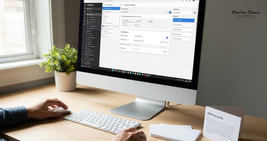
Method 1: Using the WordPress Block Editor (Gutenberg)
If you use the built-in block editor, you can make half-size cards with columns.
Steps:
- Open the page or post where you want the cards.
- Add a Columns block.
- Choose the two-column layout (50/50 split).
- Inside each column, add a Group block or Cover block.
- Add your image, heading, text, and button.
- Style the background and borders to look like a card.
Now you’ll have two half-size cards side by side.
Pro Tip: Use the “Group” block with a background color and padding to make it look more like a card.
Method 2: Using a Page Builder Plugin
Plugins like Elementor, Beaver Builder, or Divi make this even easier.
Steps in Elementor:
- Create a new section.
- Choose two equal columns.
- Drag in a Card widget (or use Image + Heading + Text + Button to build one).
- Style each column card with padding, border, and shadow.
You’ll get perfect half-size cards without touching code.
Method 3: Using Custom CSS
If you prefer to build your own style, you can use CSS.
Steps:
- Add two Group blocks or Div containers inside a parent container.
- Add this CSS in your theme’s Customizer > Additional CSS:
.card-container {
display: flex;
gap: 20px;
}
.card {
width: 50%;
background: #f9f9f9;
padding: 20px;
box-shadow: 0 2px 5px rgba(0,0,0,0.1);
}
- Add the class card-container to the parent block and card to each item.
Now, both cards will take up half the width.
Method 4: Use a Theme That Supports Cards
Some modern themes (like Astra, GeneratePress, or SEOWP theme) come with built-in card layouts. You can use their customization settings or starter templates. Many of them let you choose grid layouts that create half-size cards automatically.
Best Practices for Half-Size Cards
- Keep text short: Cards work best with small chunks of text.
- Use strong headings: Make the title clear and readable.
- Add images or icons: Visuals make cards more attractive.
- Keep spacing equal: Use padding and margin for a neat look.
- Mobile test: Half-size cards usually stack into full width on small screens. Please make sure they look good on phones.
FAQs
Q: Can I create half-size cards without a plugin?
Yes. You can use the block editor’s column block and group blocks.
Q: Do half-size cards work on mobile?
Yes. On mobile, they usually stack vertically into full width. This is normal and improves readability.
Q: Which is the easiest way for beginners?
Using Elementor or the built-in WordPress column block is easiest.
Q: Can I create more than two cards per row?
Yes. You can make 3-column or 4-column layouts for smaller cards.
Final Thoughts
Half-size cards in WordPress give your site a clean and modern layout. You can build them using the block editor, page builders, CSS, or theme settings. Choose the method that matches your comfort level. Start with a two-column layout, add your content, and style it into neat cards.
This small design choice can make your website look more professional and user-friendly.